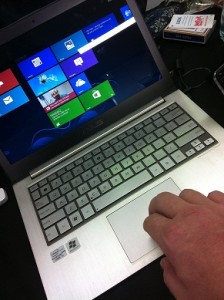
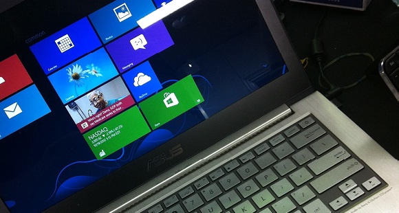
This weekend I had the chance to play around with Windows 8 on an Asus Zenbook, an ultrabook, I played with the UI and to put it mildly: I’m not excited.
Using Windows since Windows 2.0, seeing the launch of Windows 95, 98, ME, Vista, XP and 7 (not even mentioning the NT versions) this is clearly the first one that doesn’t get my adrenaline flowing (in a positive way). It’s confusing, strange and counter intuitive. A typical tech solution. Fail on Microsoft on the first approach.
Of course it’s always hard to “learn” a new Operating System (OS) but going from Microsoft Windows 3.11 to Windows 95 was easy, within a few minutes you got the “Start-button-way” and it guided you trough the different options. It was relative intuitive for a UI.
Windows 8 will need a lot of instruction video’s to teach and explain the users the core input gestures and user interactions.
I think Microsoft is in trouble here.

